Brand Identity

Sojourn

Sojourn is a luxury glamping destination offering unique, high-end outdoor/indoor hybrid experiences that combine the beauty of nature with the comfort and amenities of upscale accommodations. The brand’s visual identity must reflect this balance—where guests can escape the ordinary, embrace adventure, and still enjoy the comforts of a premium retreat. The initial discovery phase revealed a need for a brand aesthetic that sits at the intersection of two distinct worlds: the relaxed luxury of hospitality and the authentic, rugged appeal of the outdoors.


“For Those That Seek,” is a more daring, upscale approach, using bold lime green tones and a minimalist aesthetic to appeal to a younger, adventurous audience seeking something beyond traditional glamping. This direction is high contrast, with photography capturing the essence of exploration and natural beauty, inviting guests to seek new experiences.


Concept 2: Friends & Adventure


“Friends & Adventure” takes a more rugged, masculine turn, emphasizing the spirit of adventure and discovery. The bold logo with a nod to longitude and latitude coordinates reinforces the brand’s connection to exploration, while the photographic style highlights communal outdoor activities like fishing trips and campfire singalongs. The concept is designed to communicate the essence of Sojourn—whether that’s the comfort of nature, the thrill of adventure, or the desire for something unique—and to set it apart from competitors in the glamping and hospitality space.


Concept 3: Comfort Naturally


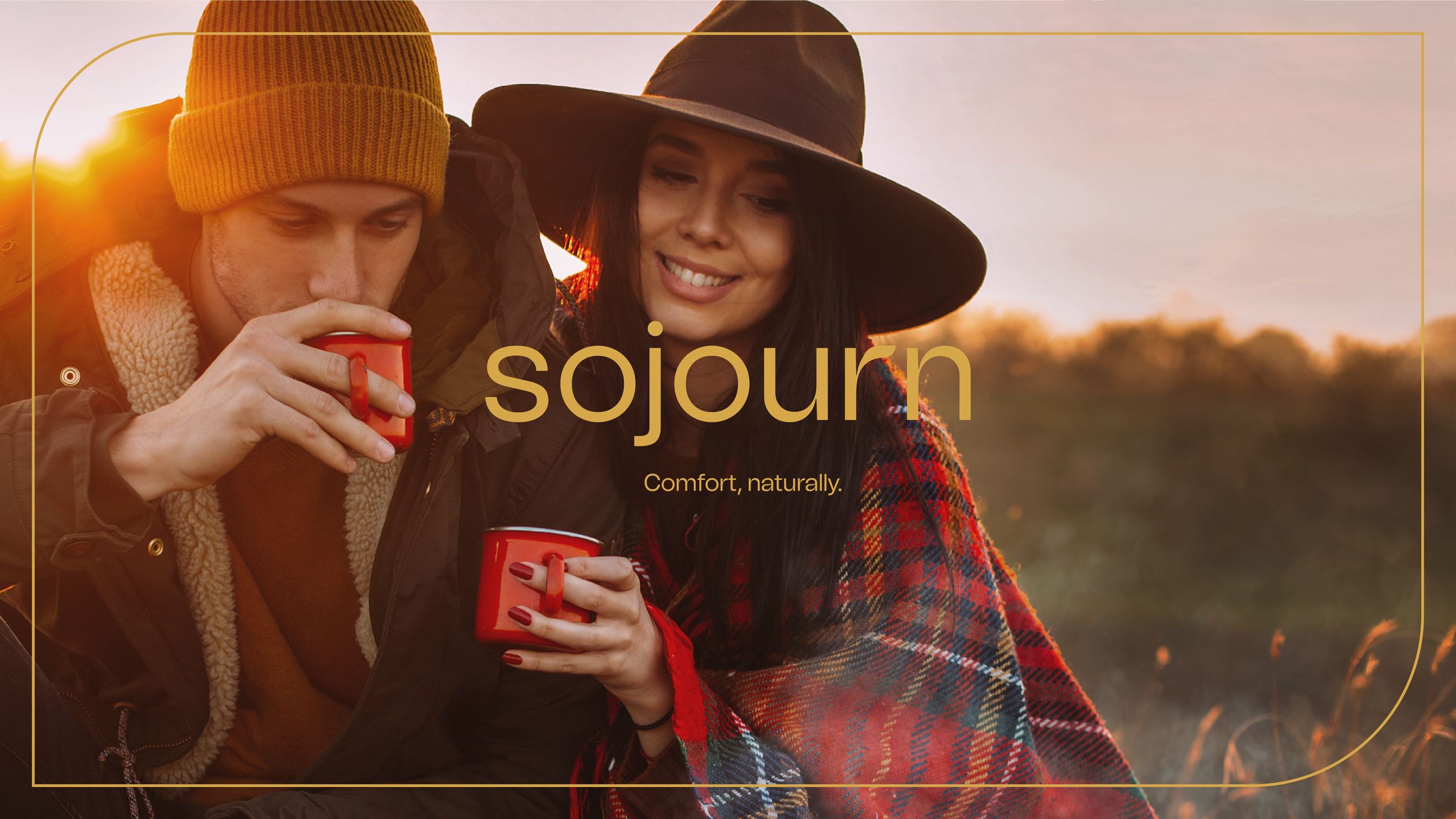
“Comfort, Naturally,” blends the essence of nature with the expectation of luxurious comfort. The logo design features clean, modern typography with a subtle nod to nature, represented by a sprouting leaf within the letter “R.” The hand-drawn illustration is used to accentuate this notion, while photography plays a key role, focusing on cozy, intimate experiences that evoke a sense of relaxation and tranquility.