Adam Dalton is a multidisciplinary designer and creative director specializing in the development of fresh new brand identities and cutting edge creative communications campaigns.

Scroll for eye candy


N2.png
 
 
Copy of Brand ID Services (32).png


Brand Identity

Norton Gaming

As a brand primarily known for cyber-safety, Norton faces the challenge of entering a new space through its 360 for gamers product. Through this venture, Norton is challenging consumers to not only view the brand as an authentic player in the gaming space, but to engage with it as an integral piece of their gaming ecosystem.

The Norton Gaming logo was designed to help meet this challenge. By tapping into the visual DNA of the original brand, the new logo aims to reach out to a new audience while remaining true to the brand’s roots as a safe, trustworthy leader in cyber-safety. By reimagining the core visual elements from the original logo, the Norton Gaming mark was designed to appear both fresh and familiar as the brand extends itself to meet the challenges and possibilities for the future of safe, secure online game play.


Brand ID Services (1).png
Brand ID Services (4).png
Brand ID Services (2).png
Brand ID Services (5).png
Brand ID Services (3).png
Copy of Brand ID Services.png


[YOUR IMAGE HERE]we23424.png


Brand Identity

Sterling Bay Life Sciences


TOURIST_KEYART_V3.jpg


Campaign: StubHub

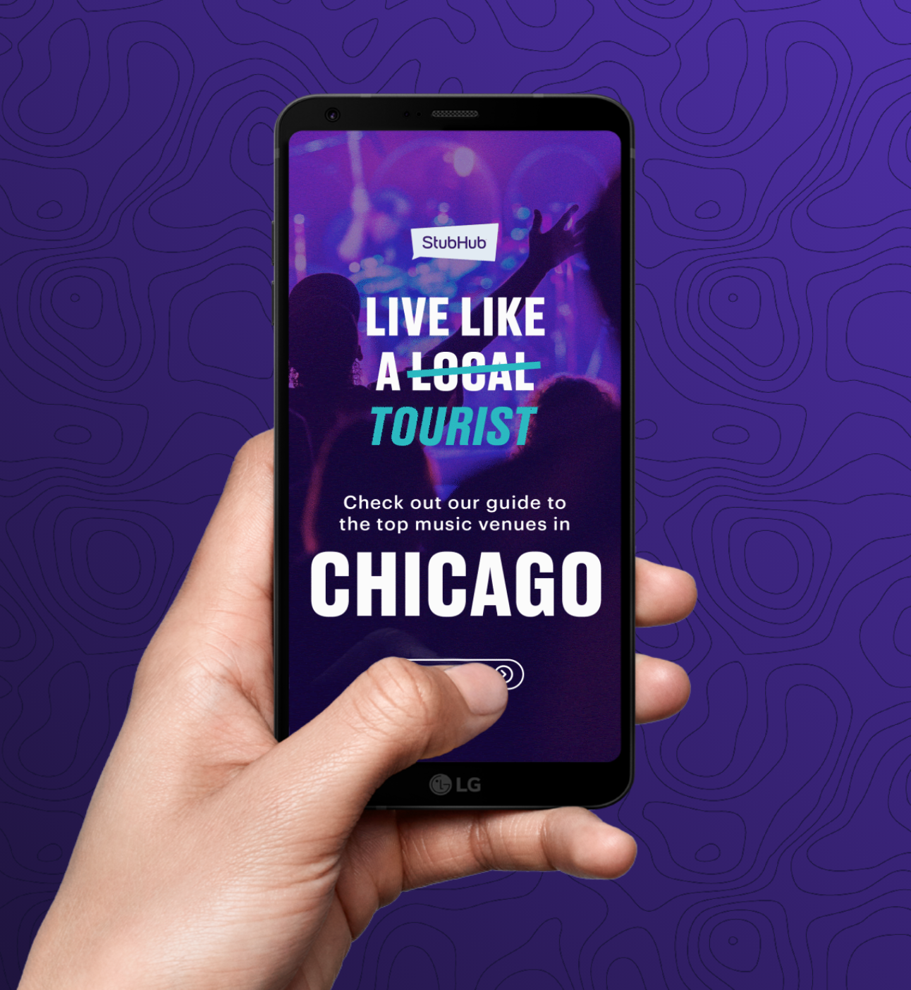
Live like a Tourist

Stubhub was contending with a declining trend in several ticket categories during the summer months. Due to busy summer travel, consumers put off attending shows and events in their hometowns until later in the fall. The campaign rallied around a simple message, locals are boring! It’s tourists who are out there living their best lives.

Working with local markets, we produced illustrated city guides for Stubhub ticket offices to distribute throughout NYC, LA and Chicago and produced a video series that compelled consumers to reject their normal routine and activate vacation mode! Paid and organic social content bolstered campaign awareness as well as upcoming events and helped guide attendees to local hotspots for pre or post event food and drinks. The Live Like a Tourist Instagram stories remain the highest performing organic social content in Stubhub history.


Copy of Brand ID Services (3).png
TOURIST_KEYART_V1.jpg
Screen+Shot+2019-06-25+at+11.57.18+AM.jpg
Screen+Shot+2019-06-25+at+11.57.34+AM.jpg
Screen Shot 2021-03-24 at 4.29.36 PM.png
Stubhub2.png
Stubhub1.png
photo1.gif


LinkedIn Cover Pic.png


Brand Identity

Molto Properties


NOW_logo_cascade_01_1.gif
 
CaryFagan_BTSFootaction12.png


Campaign: Footaction

No One Way

Footaction needed a back to school campaign that would speak individually to four different geographical regions according to the start of the new school year. No One Way needed to drive brand awareness & engagement through a breakthrough digital/social campaign that elevated Footaction’s credibility as a street style resource. Working with emerging regional ambassadors like Sheck Wes and Cary Fagan, the campaign paired guest “creative directors” with the latest back to school fashions, culminating in four distinct photo shoots tailored to each region to utilize in look books and campaign creative.


Copy of Brand ID Services (24).png
NOW_pg1.png
_MSSnfel.png
now_title_02.gif
NOW_Pages1.jpg
NOW_NYC_ORGANIC_CITYHERO.2019-06-25 15_10_11.gif
bg.png
1808388-048.jpg
_85A8225.jpg
Copy of Brand ID Services (25).png


Templeton_Logo_Final.png
 
 
butterfly.png


Brand Identity

Templeton World Charity Foundation

Templeton World Charity Foundation is a global non-profit that promotes scientific and spiritual progress through open-minded and scholarly inquiry in a wide range of fields. Seeking to re-orient the brand and minimize confusion among its sister philanthropies, TWCF needed to implement a fresh new brand identity for the organization and its various program themes.

The signature butterfly icon was designed to illustrate the crossroads of science and spirituality, evoking the essence of discovery which links all of TWCF’s innovative studies. The brand color palette was chosen to reflect the tropical location of the organization’s headquarters, while communicating the duality of science and spirituality by exploring visual polarities (white & black, blue & gold).


Stationary_3.jpg
Copy of Brand ID Services (28).png
Copy of Brand ID Services (29).png
Front_3.jpg
TWCF Homepage Desktop.png
BC_3.jpg
OKR0RO1.jpg
0201 TWCF About Desktop.jpg


Hi there. Still scrolling?
Looking for something specific? Let’s connect.


With 15+ years of experience in all types of creative mediums, this portfolio can’t capture it all.
Contact me if you’d like to talk about a particular project or just keep on scrolling.


SOS teaser 1.png


Campaign: Sounds of Saving

#FightBackWithMusic

Over the past two decades in the U.S., suicide rates have risen by 33 percent. Sounds of Saving aims to fuel the hope needed to reverse that trend, ultimately improving mental health and reducing suicide rates. Launching on World Suicide Prevention Day in 2019, SOS gifted over 1000 albums to people in New York City to raise awareness around the cause and the campaign. Musicians published their own hopeful playlists on Spotify while a suite of social media templates was designed to help amplify the campaign beyond the physical activation showcasing lyrics that heal and helpful tips on how to use music as a way to cope with depression and suicidal thoughts.


SOS teaser 2.png
SOS_3ways.gif
test3.gif
SOS_Spotlight_Animation.gif
Artboard 8.png
SOS_Data_Animation.gif
Artboard 11.png
0B811B97-8D51-4A7A-ACBF-F7EF4C7D3CE3.jpeg
DSCF2027.jpg
IMG_5377.JPG


GPFL.png
 
 
ocean-ripples-40916.jpg


Brand Identity

Greenpoint Fish &
Lobster Co.

Greenpoint Fish & Lobster Co. is a sustainable fish market and cafe in Brooklyn, NYC. It’s mission is simple: to offer the freshest oysters, lobster rolls and ceviche, plus lessons on oyster shucking, lobster steaming and a whole lot more. 

Tasked with creating a new brand rooted in the rich tradition of a New England style fish market without coming across gimmicky or pedestrian, we delivered a custom stamp that is as sustainable as it is of the neighborhood in which it resides. It’s a timeless nod to the DIY aesthetic which encapsulates many of the areas surrounding businesses and streets.


GPFL.png
Fresh-Catch-Image-Update-Desktop.jpg.image.1440.png
p.jpeg
Greenpoint_Fish_Lobster_flyer_Design.png
static1.squarespace.png
9dc5fa_76a606c69c0d4300abe42e4253301be3_mv2.jpeg